Adult Swim Games
Circa 2015, when I started as a senior designer at Adult Swim Games, the company was best known for its hit mobile and flash games. Although its 13 PC titles were well-received, the brand wasn’t valued as the premier publisher of independent games that it was and is today.
With its first major video game convention months away, a new look and feel was necessary. Great care was applied when approaching the logo mark and visual identity system as to honor the distinctiveness of the parent brand.

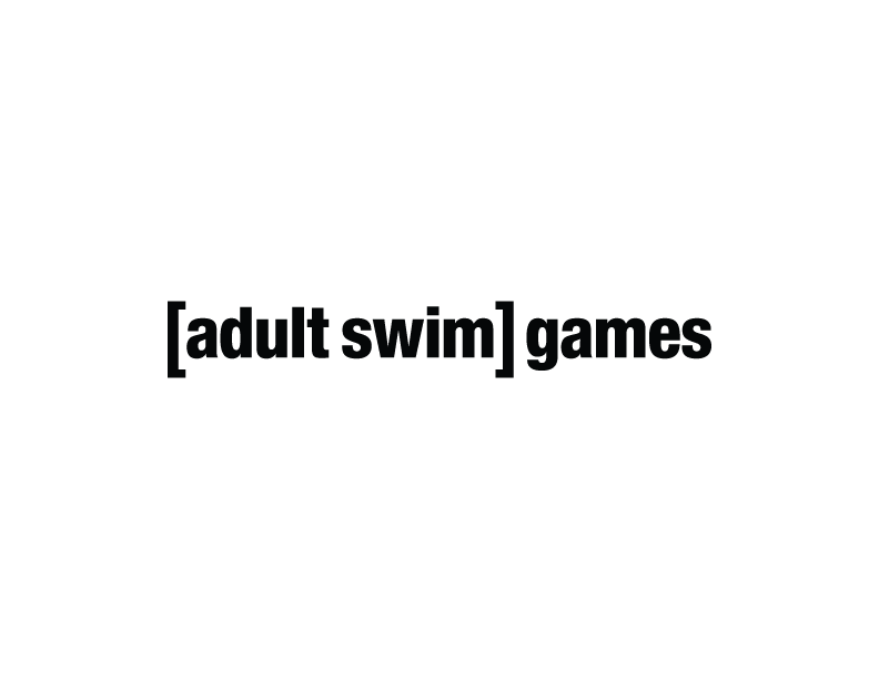


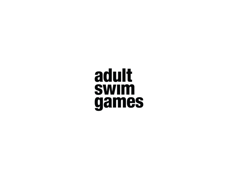
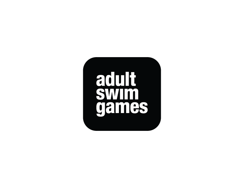

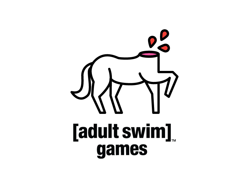
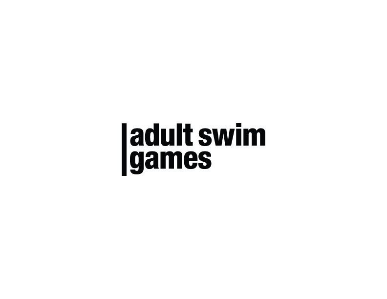

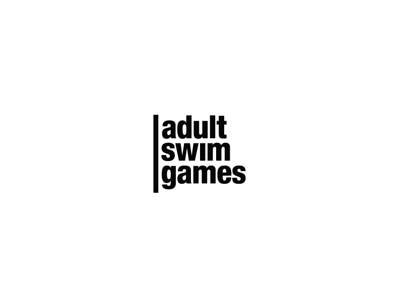

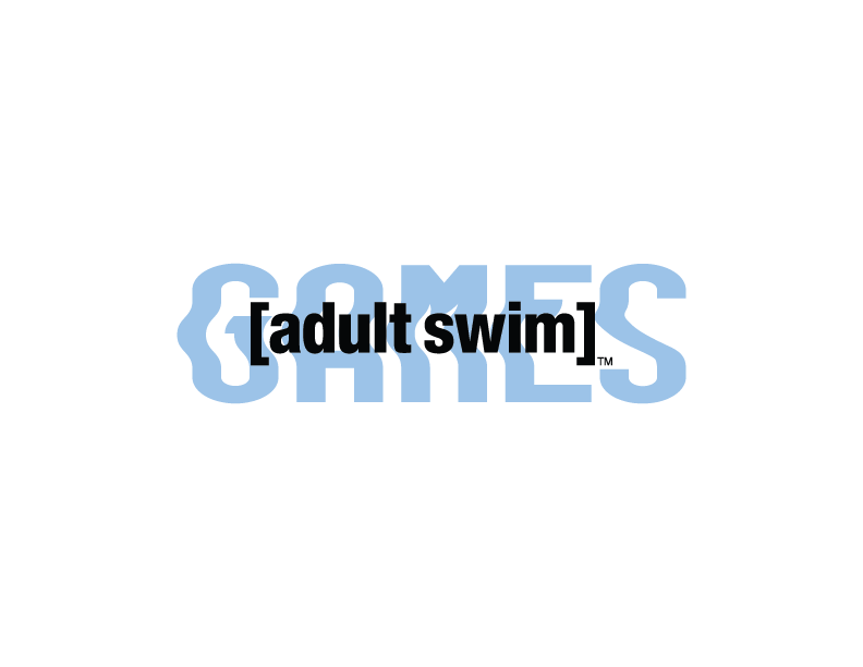
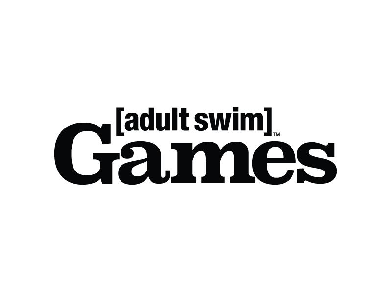
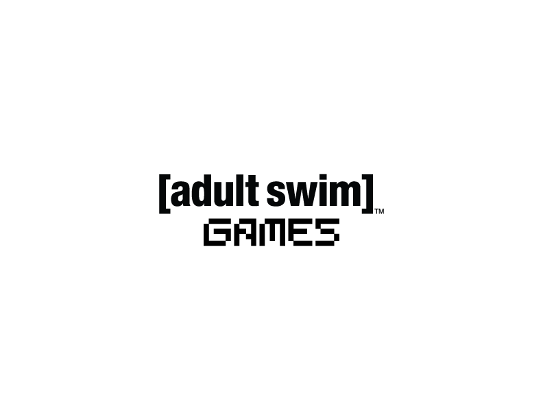

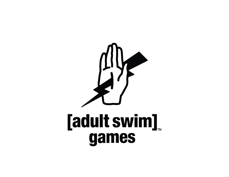
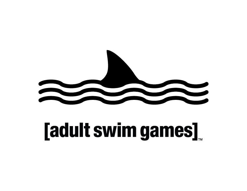
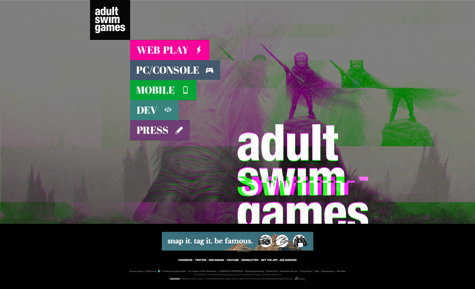
The greatest challenge in creating a successful logo was to maintain top-level visibility without detracting from the game art it would represent. When exploring logo options, several word and visual marks were created, working toward a natural fit with the existing brand.
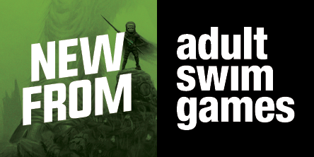
The solution was simple and elegant – flexible enough to pair well with all visual styles while being bold enough to stand out against them.
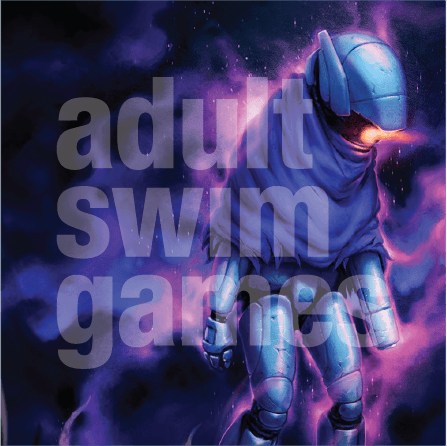
The next step was to develop the branding further while creating a compelling presence at the convention. The design of all subsequent assets reintroduced the Adult Swim Games brand as a publisher of independent titles while emphasizing the catalog of games that would soon be released.


Royalty-free woodcuts were digitally scanned and manipulated to create a series of tarot card-inspired designs, each one highlighting a different protagonist from the demoed titles. Some assets were then run through an online glitch script several times and edited together for a cohesive and contemporary look.
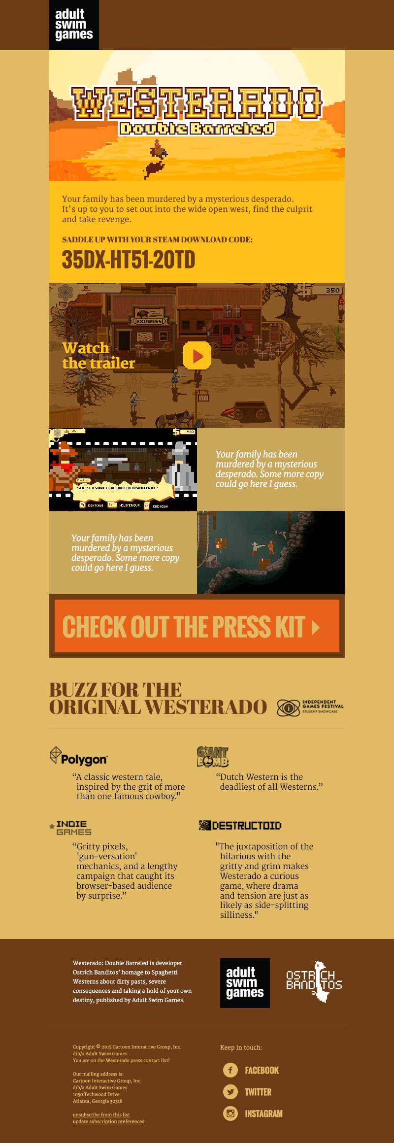
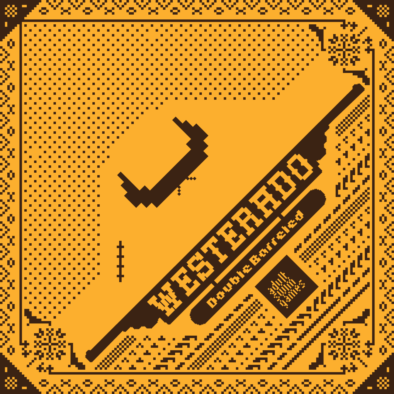
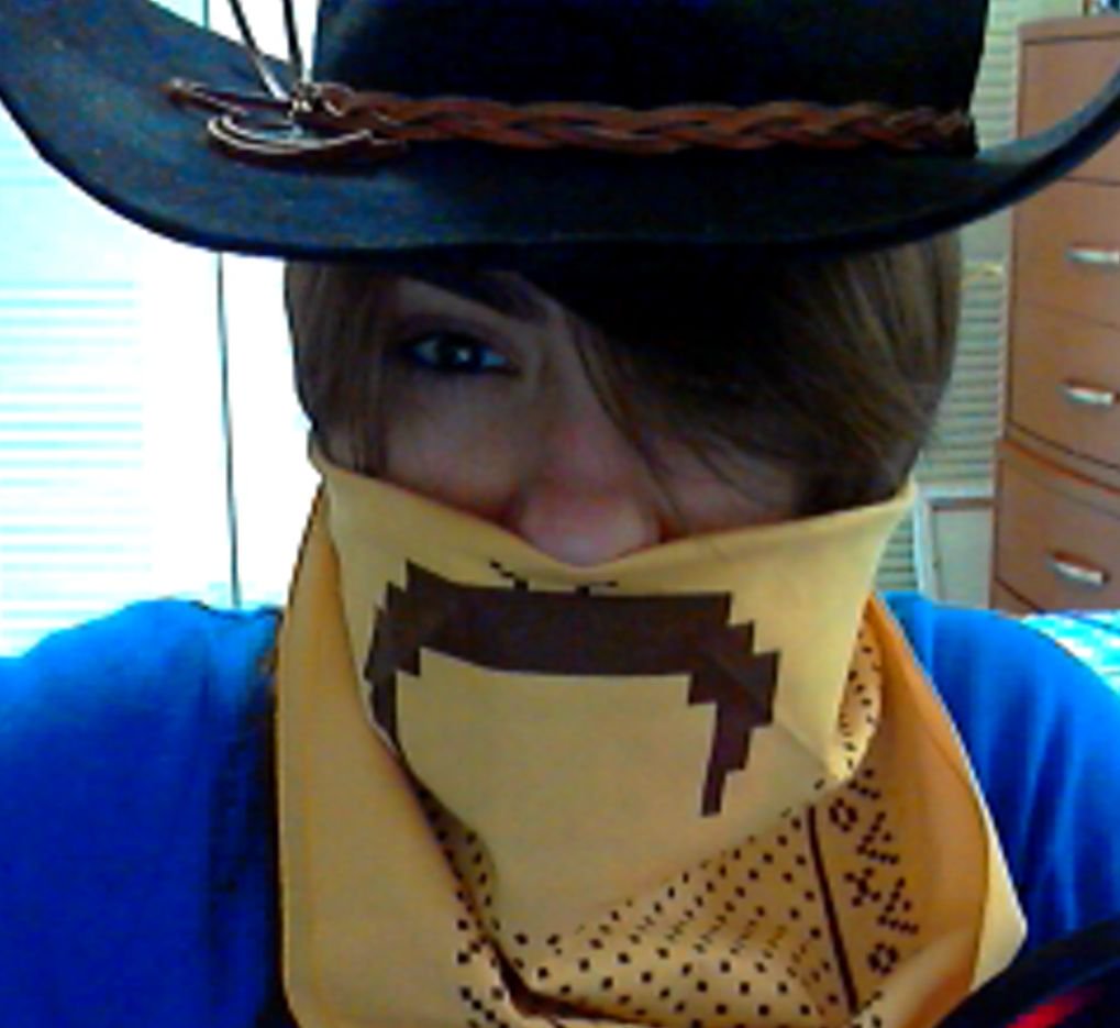
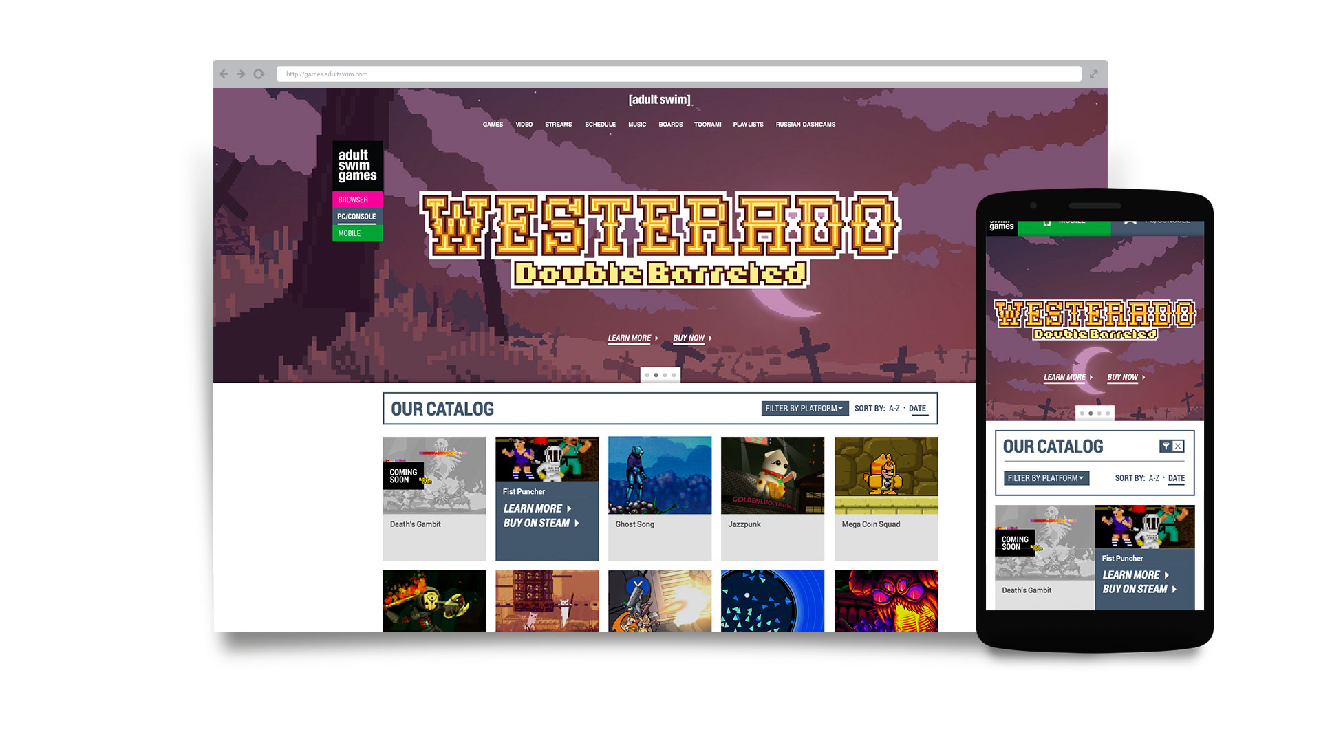
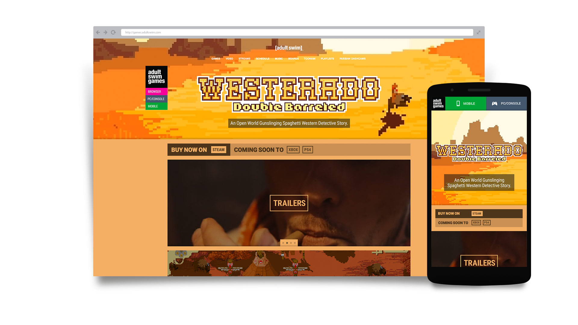
I also created promotional bandanas for the game Westerado: Double Barreled, which gave the wearer an 8-bit mustache. Con-goers seemed to appreciate their silliness.


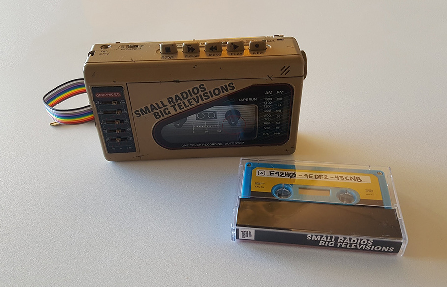
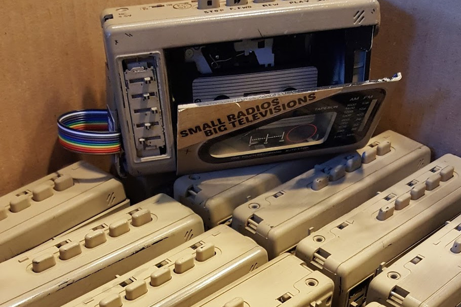
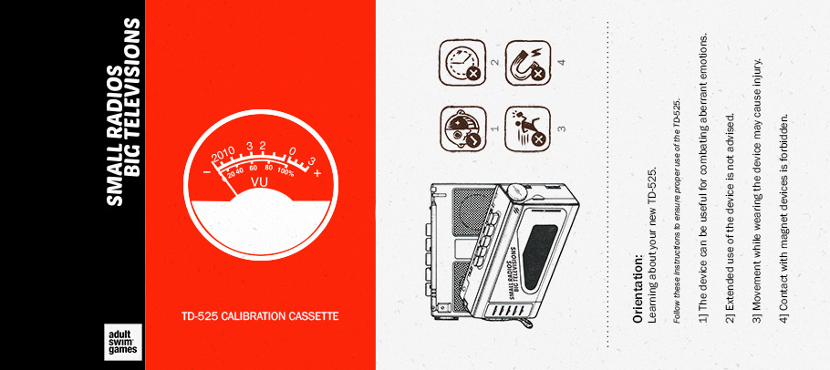
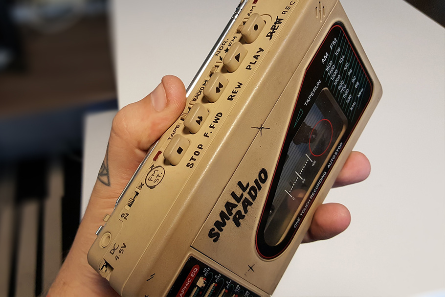
For the game Small Radios, Big Televisions, we wanted to assemble a press kit intriguing enough to motivate the recipient to download the game online. I decided to order 50 portable cassette players, disassemble, reassemble, spray paint, and hand-label each one, and include a cassette tape, complete with a custom-designed jacket. Each tape came with a code the recipient could use to access the game.
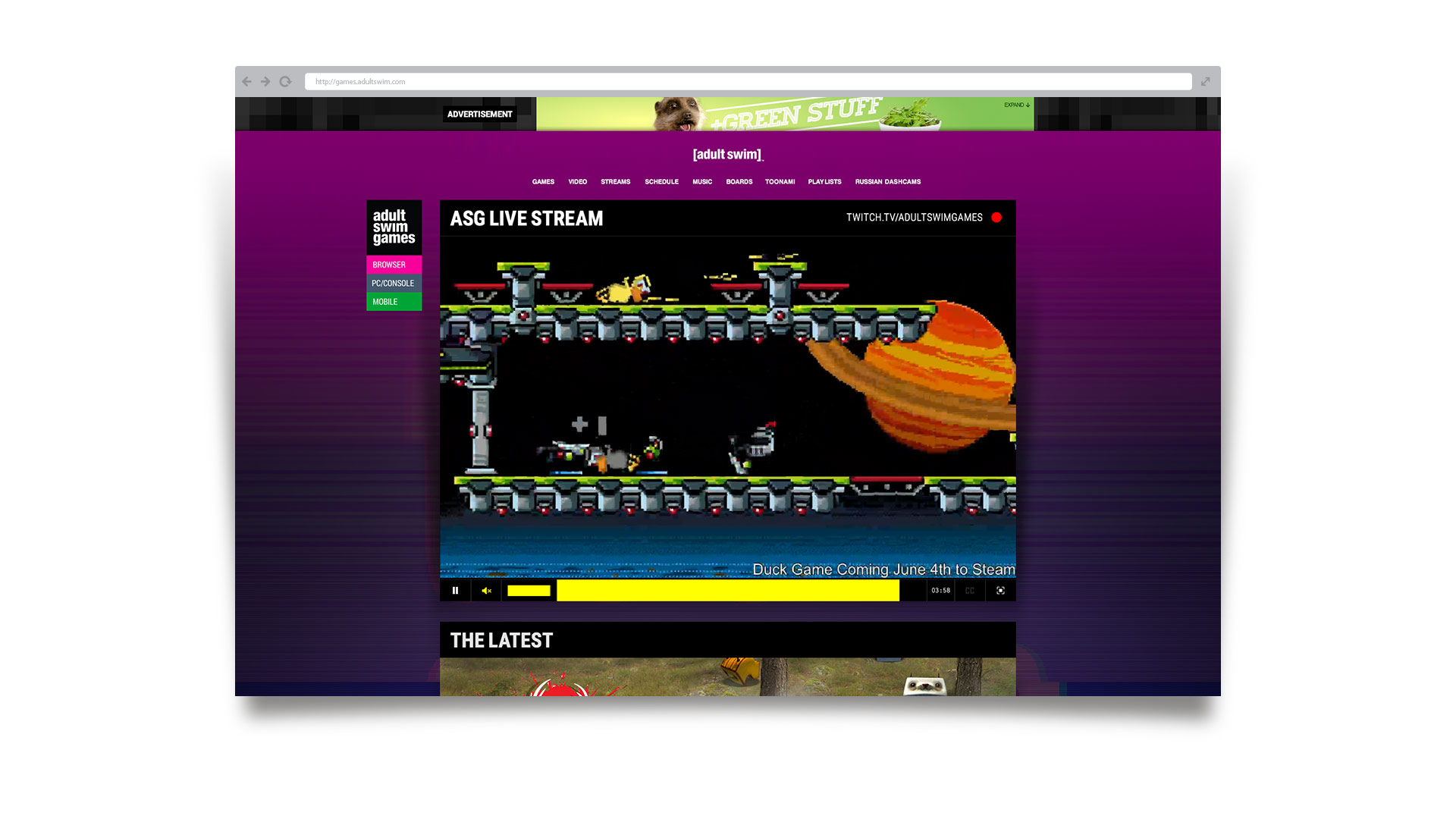
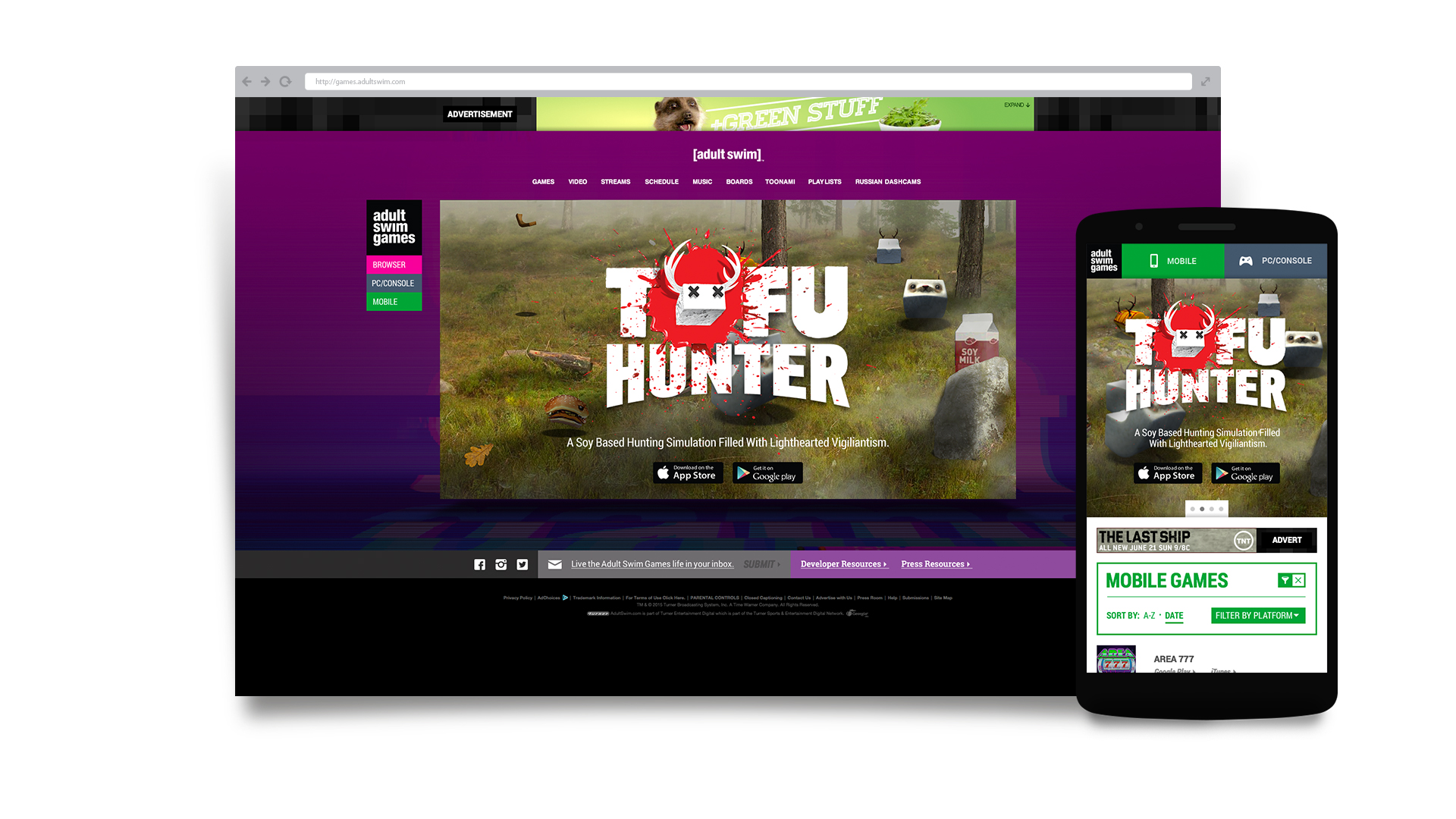
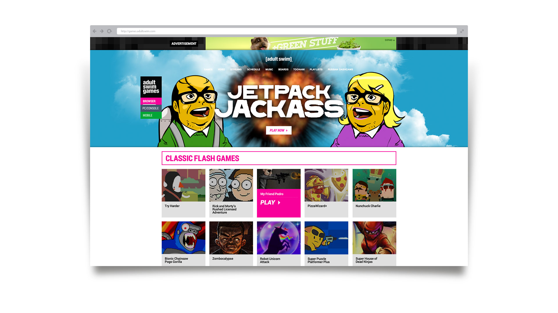
Next on the agenda? Auditing the user experience and interface of the company website. It was clear that we needed to rethink the accessibility of an extensive library of flash games and create a site architecture that satisfied both user and business needs. Through many iterations and a process of design by committee, the final result was an amalgamation of compromises.

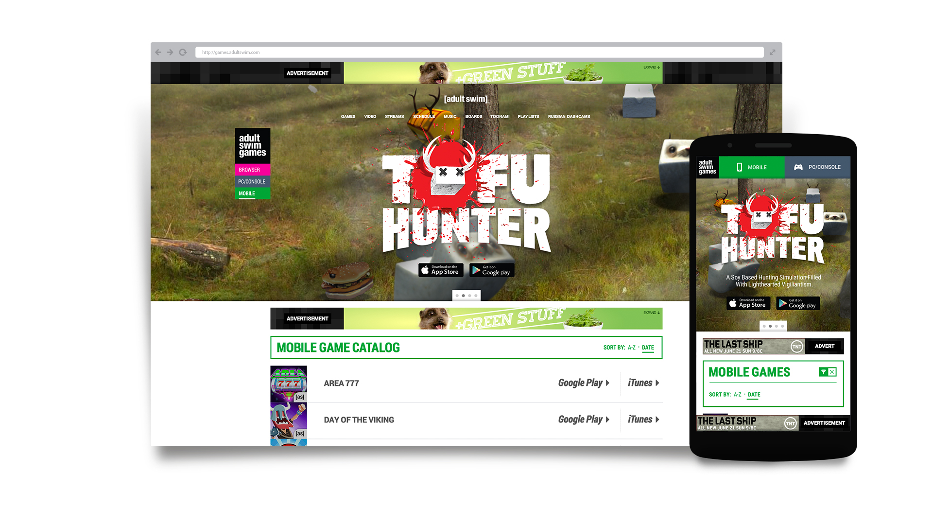
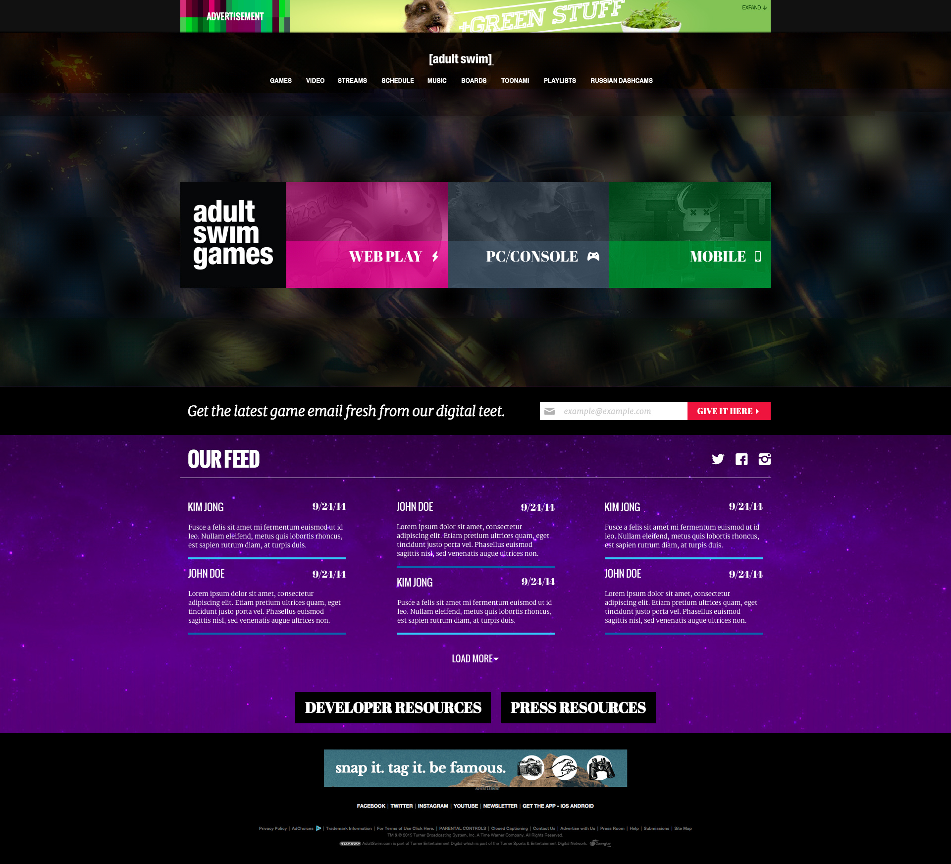
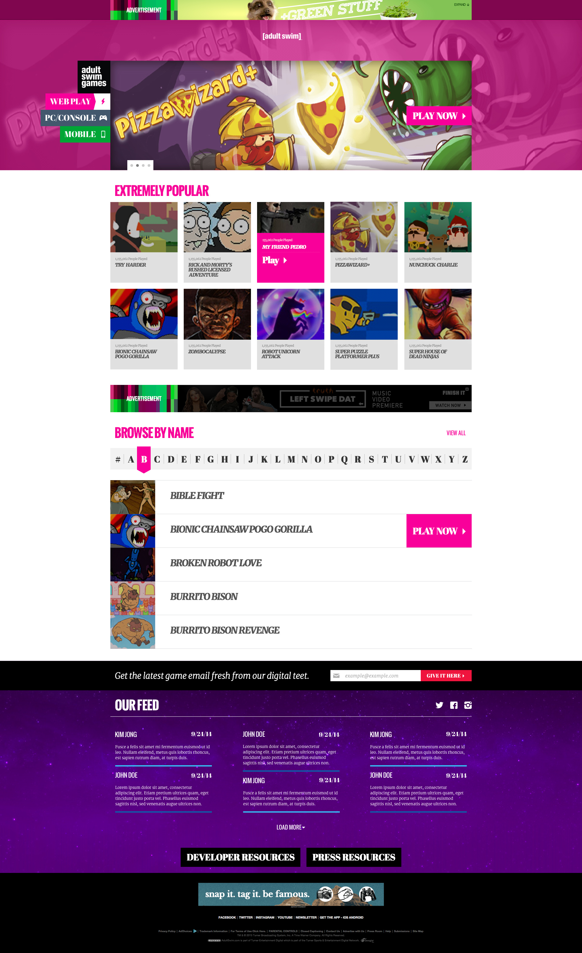
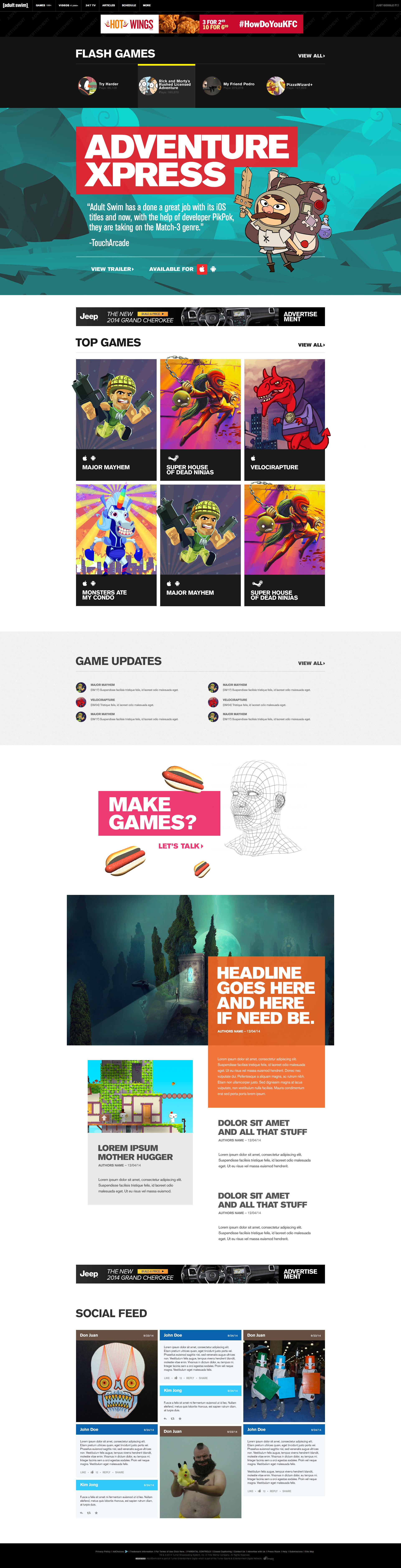
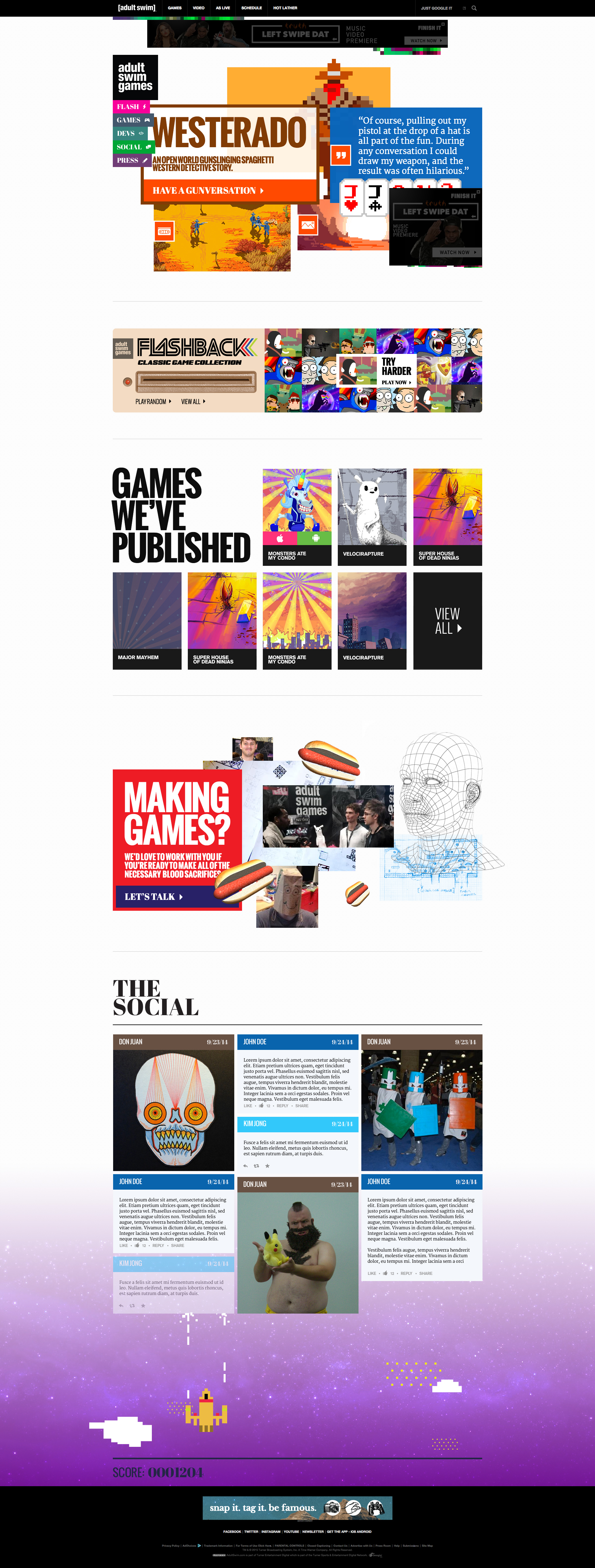
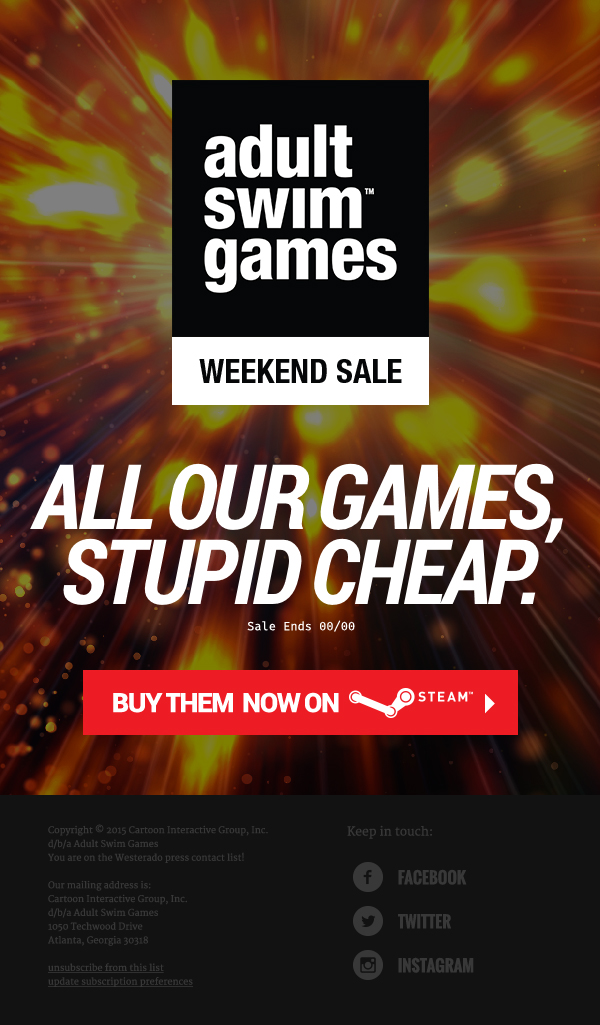
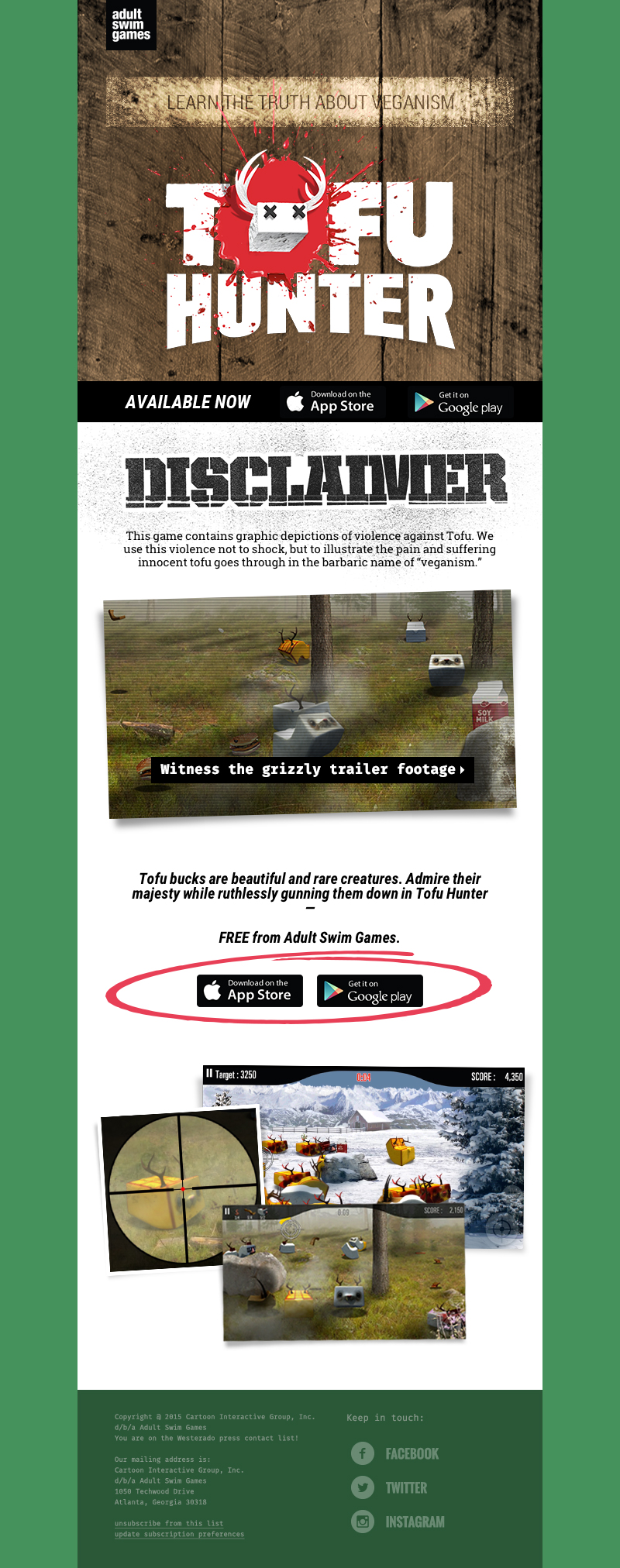
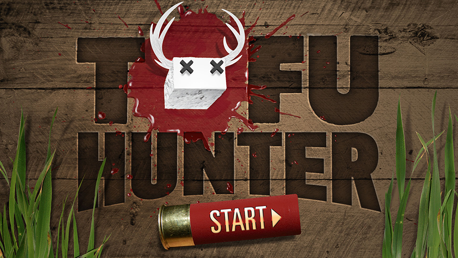
Other responsibilities that went into supporting and growing the brand included designing consumer-facing email campaigns and several game logos, creating microsites, overhauling the UX and UI for several game titles, crafting iconography for a variety of applications, and strategizing marketing solutions that triggered downloads and purchases.